A Magazine Mirroring Murmuring Music.
Editorial Identity Crafted to Echo Emotion.
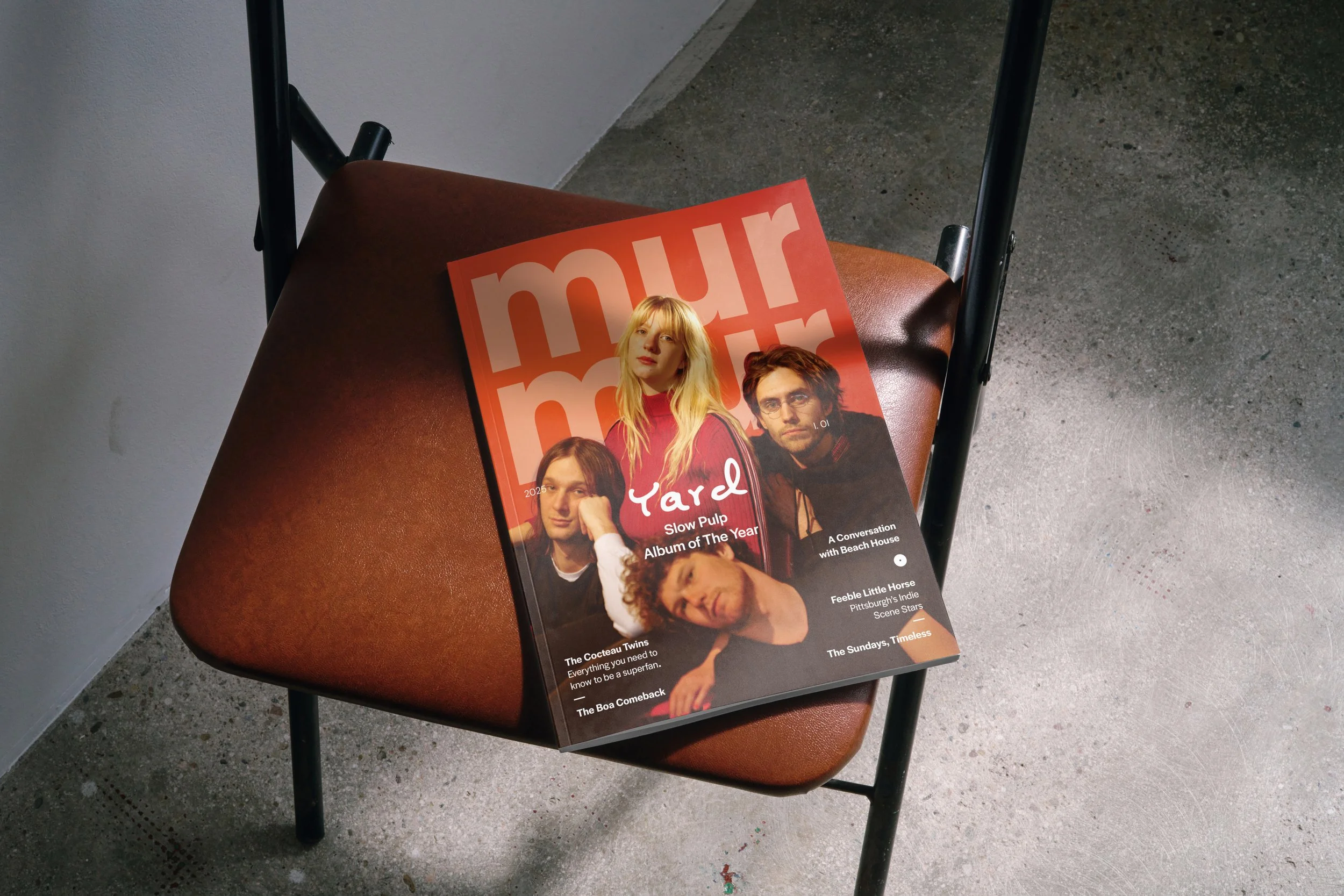
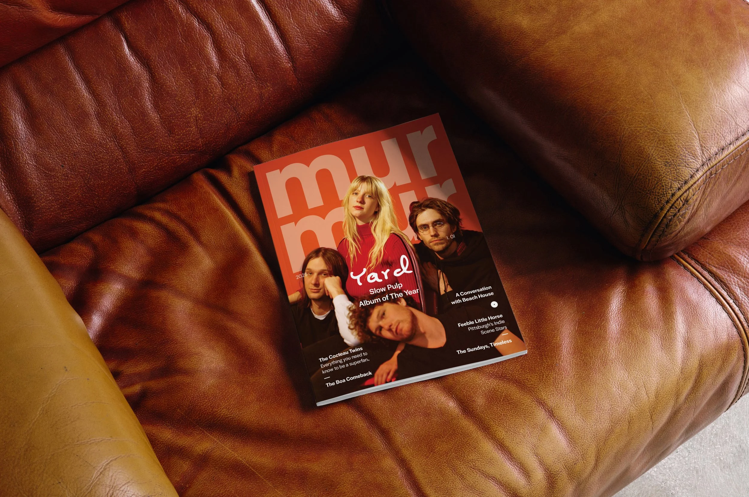
Murmur Magazine was born from a deep love for music that exists just beneath the surface, sound that’s felt as much as it’s heard. The project began with the goal of developing a full editorial concept, visual identity, and content framework for a niche publication. The result was Murmur: a bi-monthly music magazine dedicated to celebrating, documenting, and amplifying the sounds and stories of indie rock, dreampop, and shoegaze. Murmur works to give emerging artists a platform, preserve the rich history of these genres, and foster a community rooted in ambient and independent music.
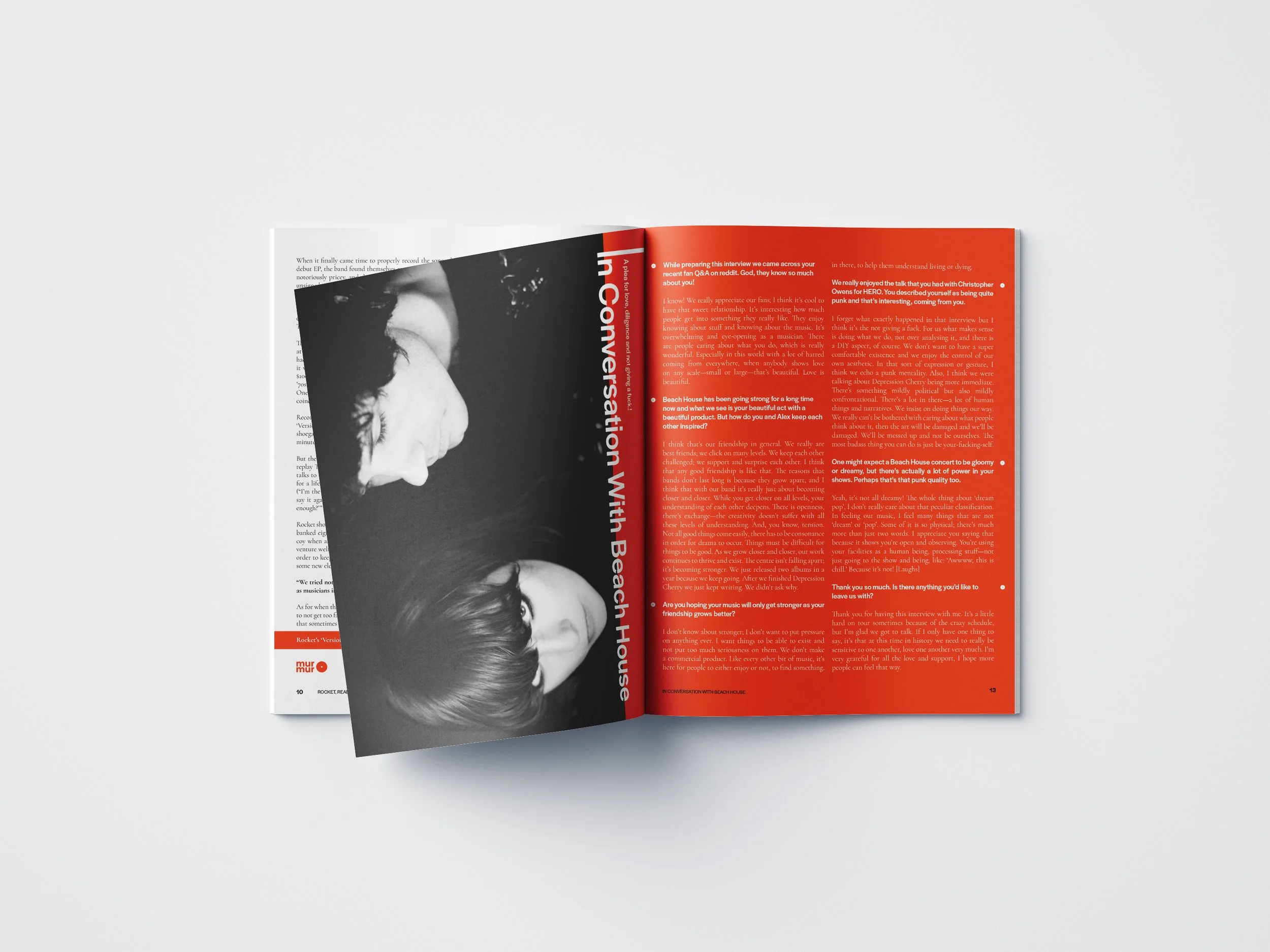
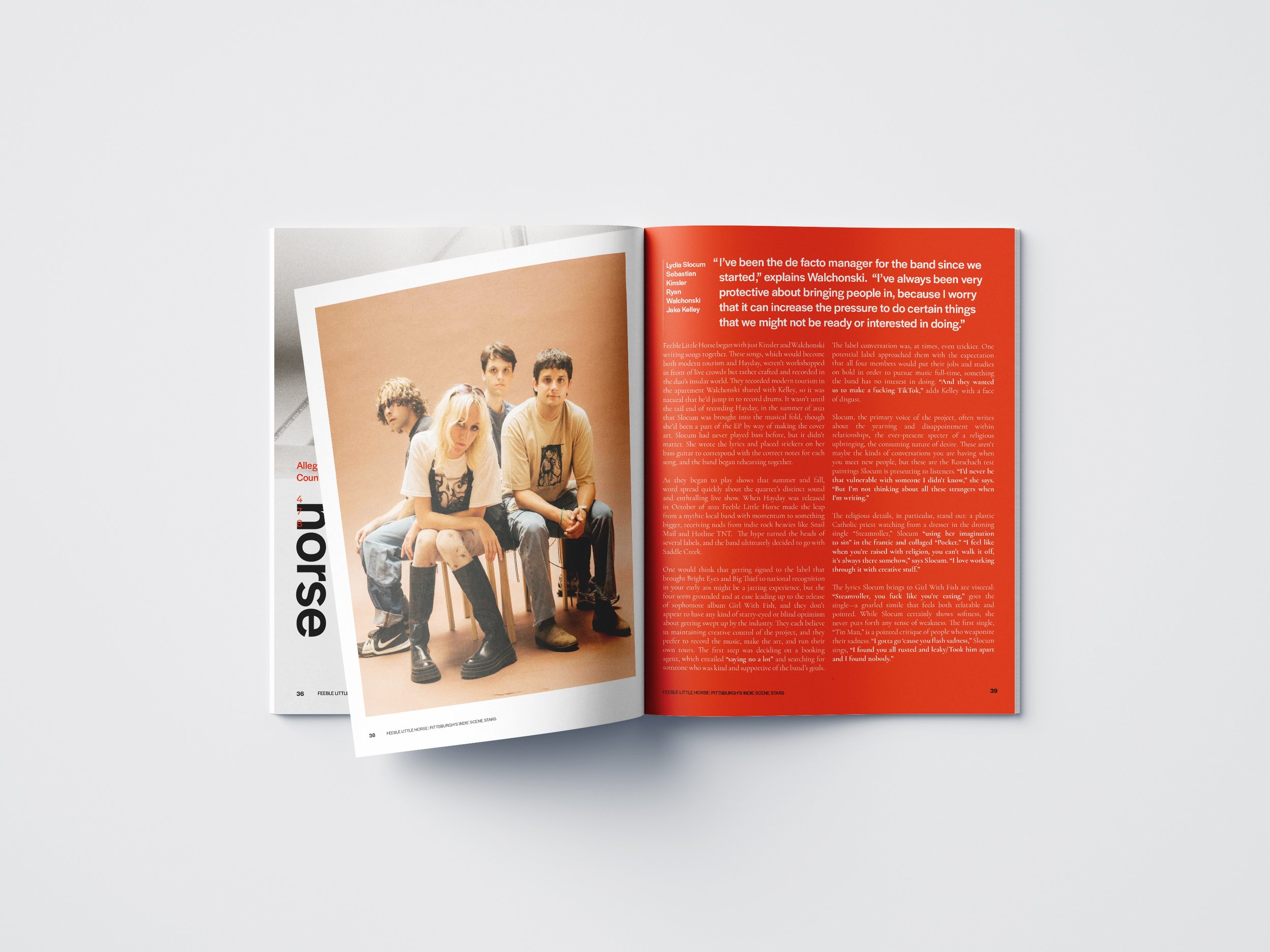
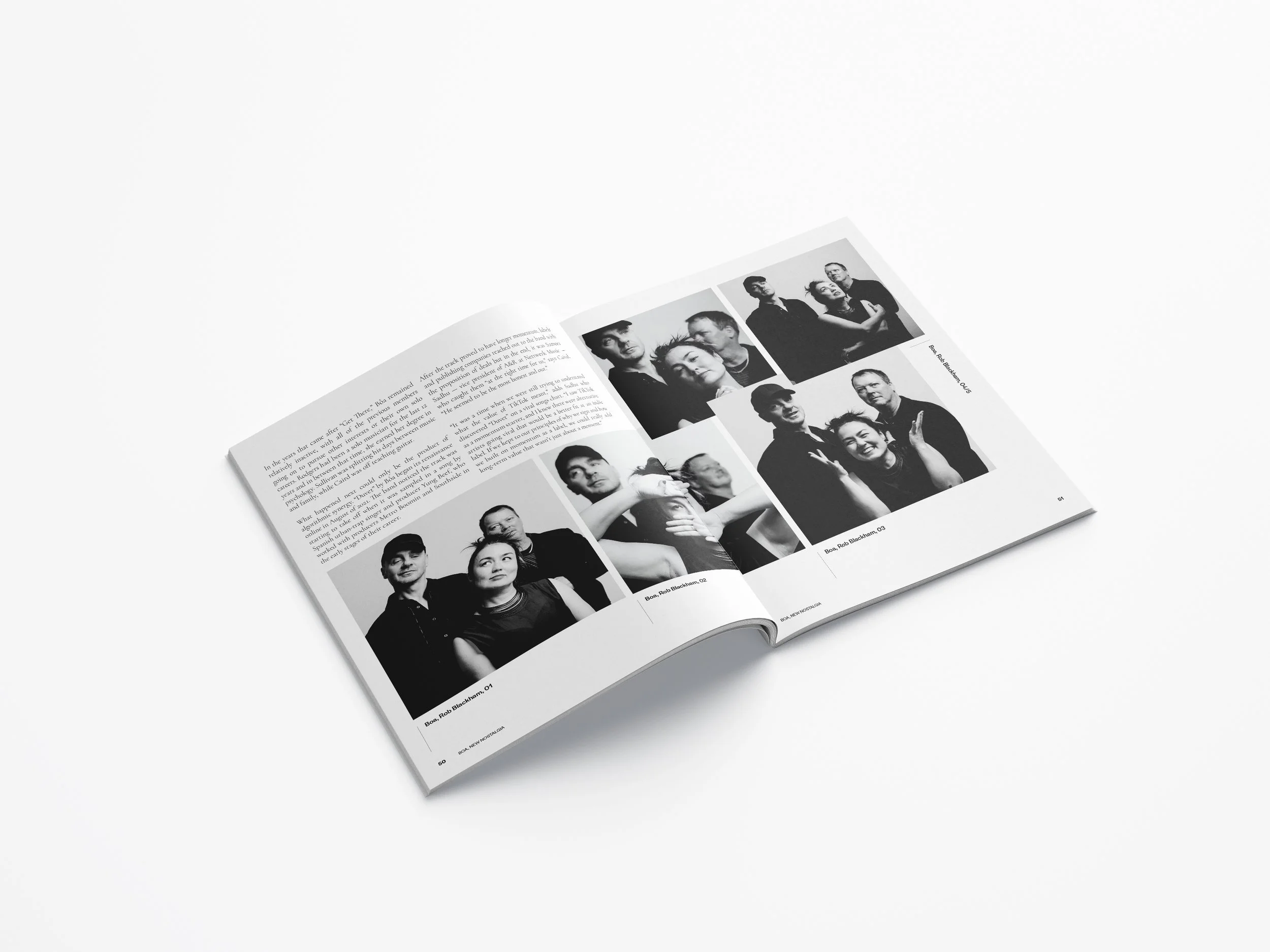
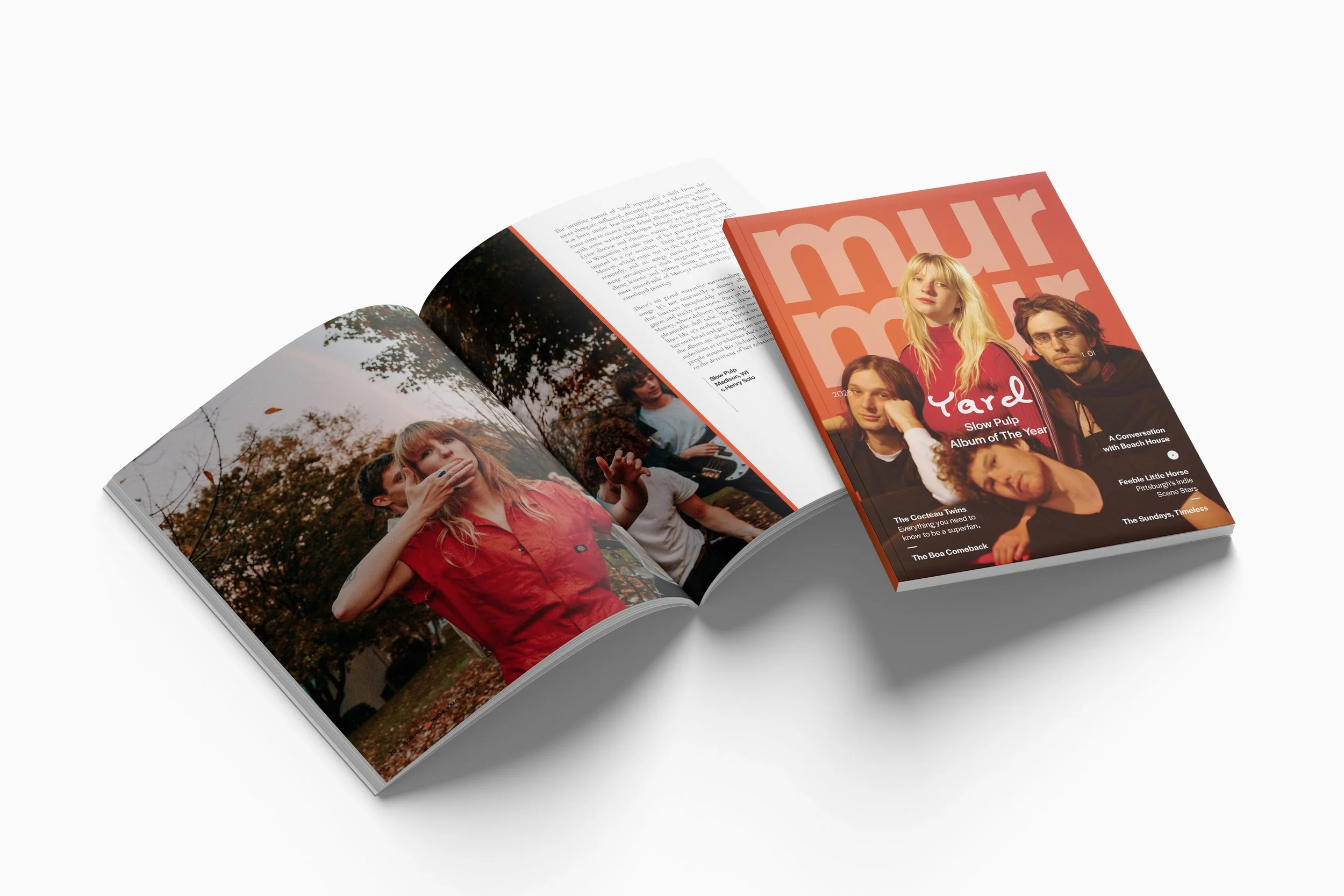
From its foundation in layout design, Murmur evolved into a study of visual tone and editorial organization. I created a full identity system including a logo, wordmark, and masthead, alongside the design of Issue One. The debut issue features six curated articles, an artist interview, a product catalog, custom advertisements, and complementary content, all unified through a mood driven design language.
Category
Brand Identity + Publication Print Design
Year
2025
Client / Context
Conceptual Design Study


HEX #EF4825 RGB 238, 72, 37 CMYK 0%, 8%, 97%, 0%
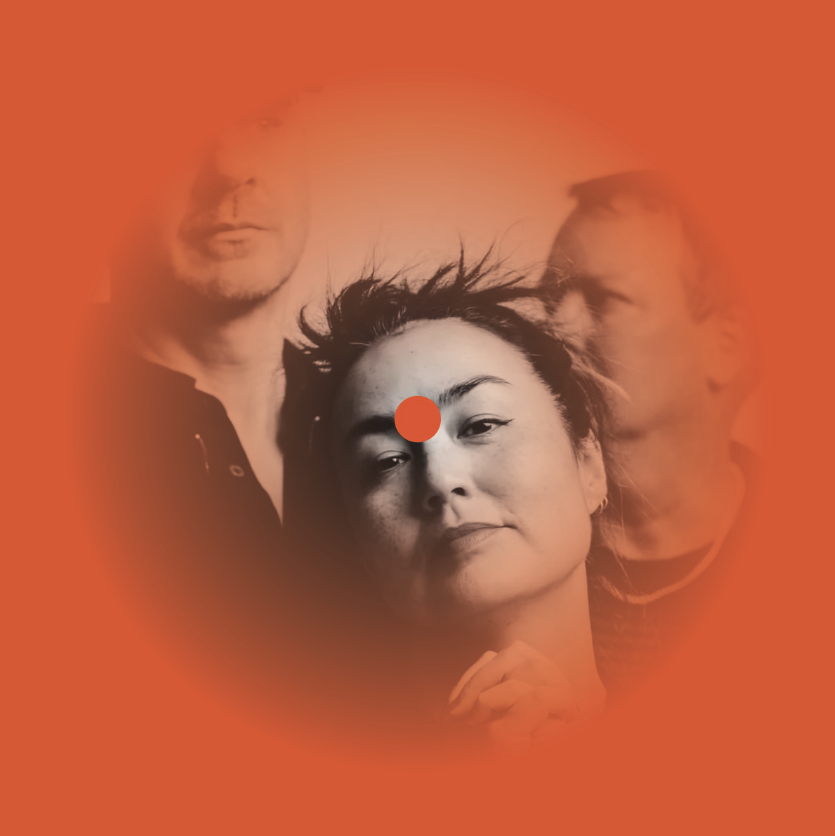
Wavelength
Shifting through varying opacities, mimicking the atmospheric and ethereal qualities of the music Murmur celebrates.

The warmth of a tube amp, the glow of stage lights, an
equalizer peak, or the club sign at your local venue.
Wavelength is a desaturated reddish-orange, reminiscent of heat signatures in infrared imagery, a type of electromagnetic radiation invisible to the human eye but felt as heat.

With longer wavelengths than visible light, infrared exists just outside our perception, like a soft, distant vocal or an ethereal note echoing through reverb. It’s a frequency, something felt more than seen.
Read Murmur Click the top right to flip