
Union & Galena
2023
Chicago
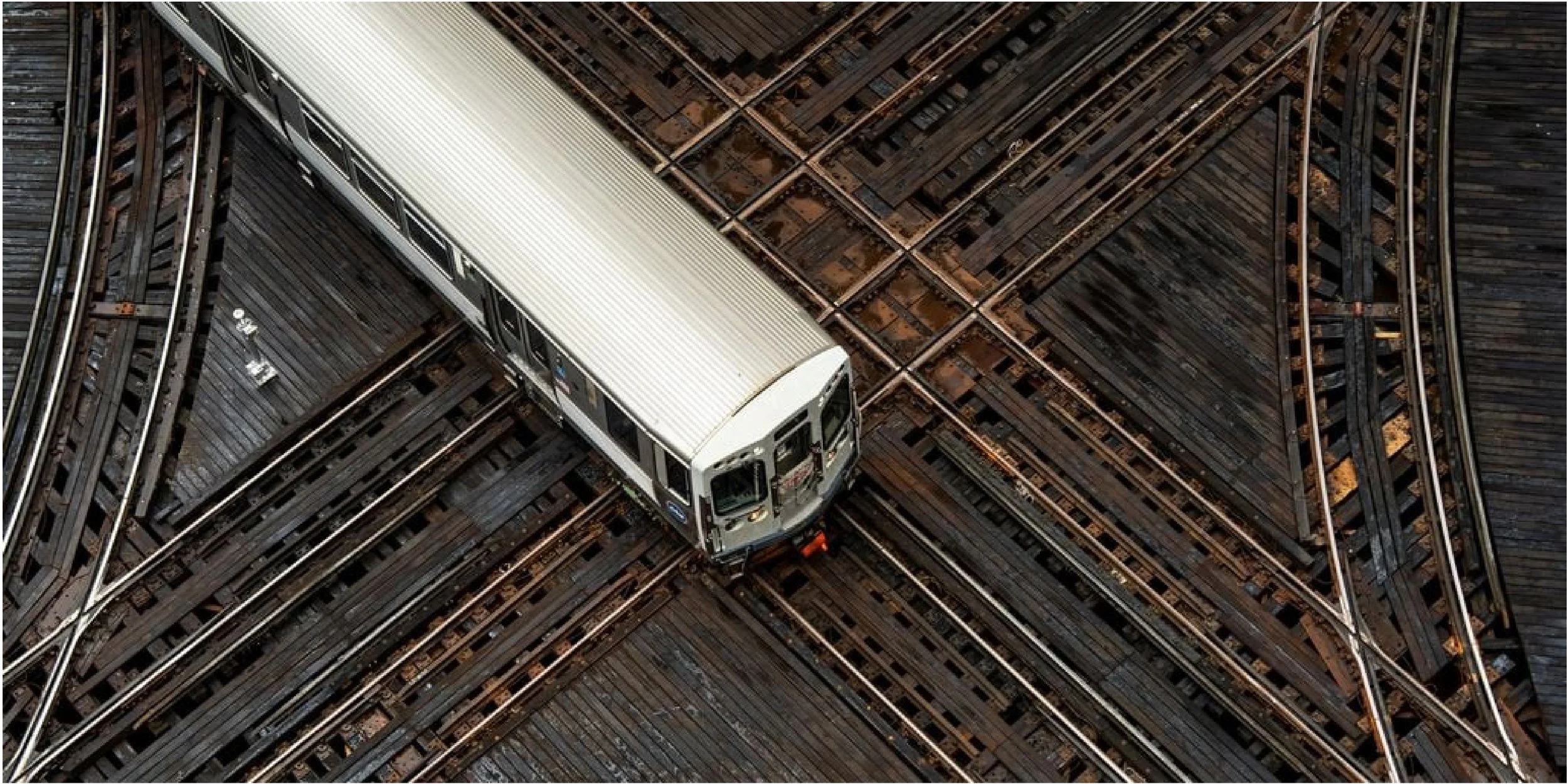
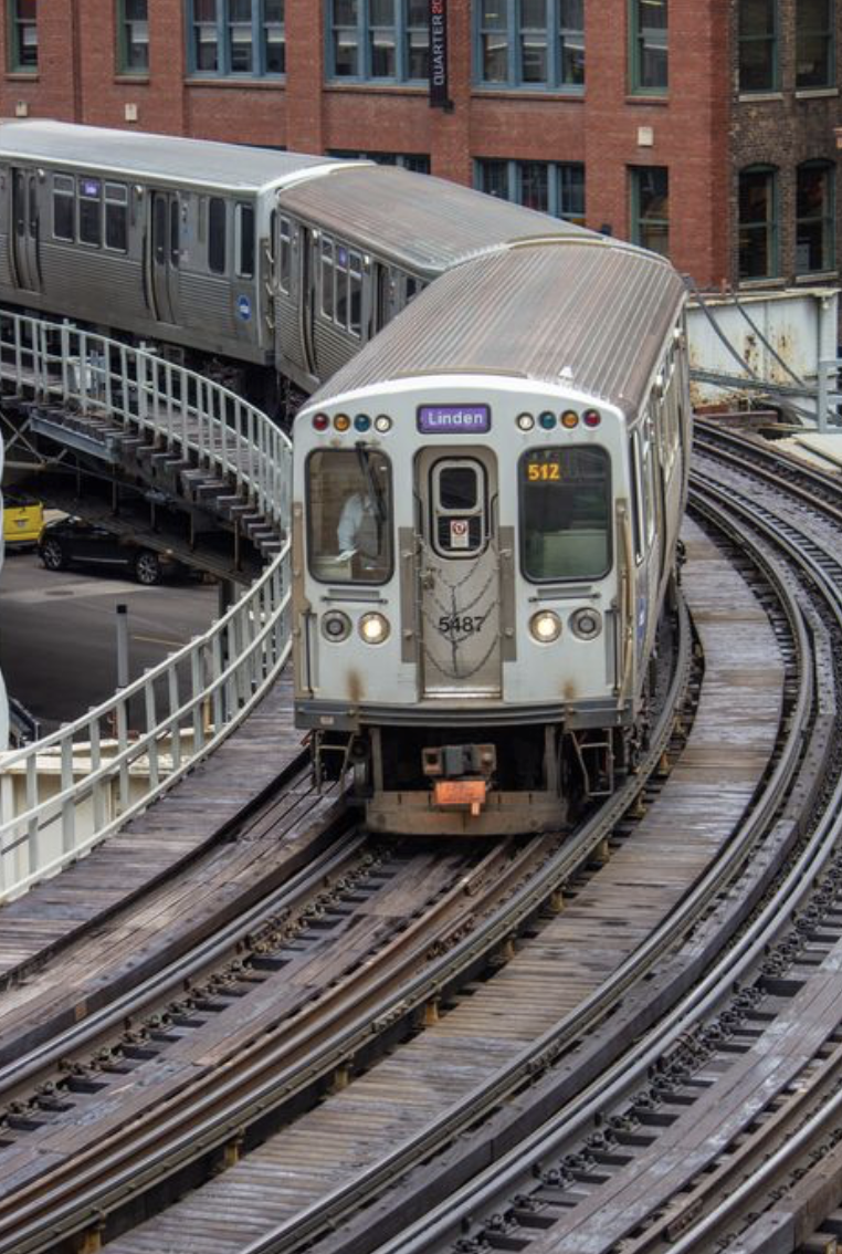
The Union & Galena Typeface draws inspiration from the intricate shapes of Chicago's railroads and its rich history of public transportation. Named after Chicago’s first railroad, the "Galena & Chicago Union," Union & Galena incorporates the elaborate forms and configurations found in the city's numerous tracks, transforming them into contours and angles within the letterforms. As train lines intersect and change direction, a body of organic yet systematic shapes emerge, repeating themselves and changing orientation across 300+ miles of track in the nation's largest public transportation system.
Letter-forms


-
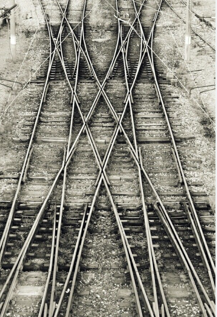
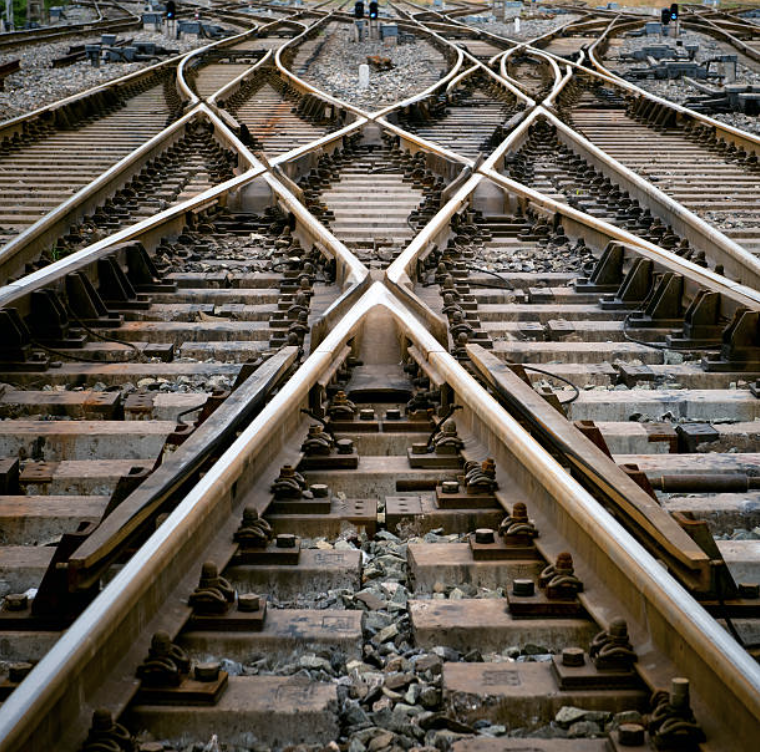
The A mimics the shape of a Rail Turnout a component that allow trains to switch from one track to another, particularly the diverging track which curves away from the straight path.
-
The B mimics the stacking of two railroad components, a crossover combined with the angular format of straight tracks.
-
The C follows the form of the Loop, the oval shape has straight lines and rounded corners with a small radius The loop is the center of much of Chicago's Public transit.
-
The D follows the crossover component, a combined angular format with straight tracks.
-
It all begins with an idea. Maybe you want to launch a business. Maybe you want to turn a hobby into something more.
-
It all begins with an idea. Maybe you want to launch a business. Maybe you want to turn a hobby into something more.


-
It all begins with an idea. Maybe you want to launch a business. Maybe you want to turn a hobby into something more.
-
It all begins with an idea. Maybe you want to launch a business. Maybe you want to turn a hobby into something more.
-
It all begins with an idea. Maybe you want to launch a business. Maybe you want to turn a hobby into something more.


-
It all begins with an idea. Maybe you want to launch a business. Maybe you want to turn a hobby into something more.
-
It all begins with an idea. Maybe you want to launch a business. Maybe you want to turn a hobby into something more.
-
It all begins with an idea. Maybe you want to launch a business. Maybe you want to turn a hobby into something more.


-
It all begins with an idea. Maybe you want to launch a business. Maybe you want to turn a hobby into something more.
-
It all begins with an idea. Maybe you want to launch a business. Maybe you want to turn a hobby into something more.
-
It all begins with an idea. Maybe you want to launch a business. Maybe you want to turn a hobby into something more.

-
It all begins with an idea. Maybe you want to launch a business. Maybe you want to turn a hobby into something more.


-
It all begins with an idea. Maybe you want to launch a business. Maybe you want to turn a hobby into something more.
-
It all begins with an idea. Maybe you want to launch a business. Maybe you want to turn a hobby into something more.
-
It all begins with an idea. Maybe you want to launch a business. Maybe you want to turn a hobby into something more.


-
It all begins with an idea. Maybe you want to launch a business. Maybe you want to turn a hobby into something more.
-
It all begins with an idea. Maybe you want to launch a business. Maybe you want to turn a hobby into something more.
-
It all begins with an idea. Maybe you want to launch a business. Maybe you want to turn a hobby into something more.


-
It all begins with an idea. Maybe you want to launch a business. Maybe you want to turn a hobby into something more.

-
It all begins with an idea. Maybe you want to launch a business. Maybe you want to turn a hobby into something more.
-
It all begins with an idea. Maybe you want to launch a business. Maybe you want to turn a hobby into something more.


-
It all begins with an idea. Maybe you want to launch a business. Maybe you want to turn a hobby into something more.
Observe how the typeface pays homage to the Chicago Loop in the letters “O”, “C”, “G”, and “Q”, mimicking its rectangular shape with rounded corners. The letters “F”, “K”, “P”, “R”, and “Y” exemplify shapes that result from a “railroad switch” or “turnout,” guiding trains from one track to another. Many other letterforms are crafted from a fusion of shapes coming from railway “junctions”: the physical connection of tracks as they converge or diverge.

Research & References


Examining the design and history of the elevated rail system (the “L”), especially its iconic Loop, which inspired elements like the rounded rectangular shapes in key letterforms.
Delving into archival maps and photographs of the Loop and other track systems to identify recurring patterns and unique features.
Analyzing the mechanics and geometry of railroad switches and turnouts.
Observing how the interaction of straight and curved tracks forms dynamic and functional shapes, translating these into the typeface’s angular and curved elements.
The creation of the Union & Galena Typeface required in-depth research into both Chicago’s railway infrastructure and the broader visual and historical elements of its public transportation system. Here are some of the key aspects of the research process
